
Apos Healthcare Follow-Up
A new app that allows patients to handle follow-up appointments when it’s convenient for them. It tracks progress over time to highlight patterns and help keep patients motivated.
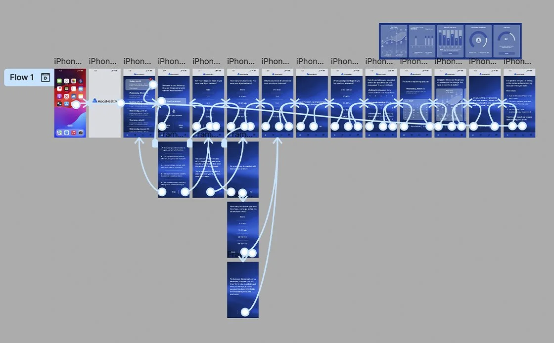
Process
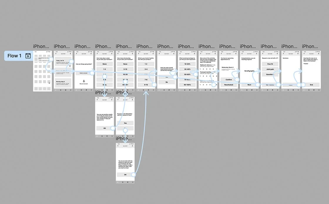
The process started by translating the current phone-based process into a digital, in-app experience. Understanding was built through user research, ideated using rapid visualization, explored concepts through prototyping, validated ideas with user testing, and refined solutions through multiple iterative cycles.
The problem
Phone-based follow-up appointments create barriers to patient engagement, as many patients avoid unknown calls due to scam concerns and lack control over timing. This leads to missed follow-ups, reduced adherence to care plans, and limited visibility into patient progress. Without clear, visual feedback, patients who fall behind may disengage, while patients who are ahead cannot easily progress. These challenges reduce compliance and limit patients’ sense of control over their care.
My role
Lead UX designer, UI designer, UX researcher, Graphic designer, Product designer, and Technical writer.
Research
Following their appointments, select patients participated in the study. Analysis of phone-based follow-up interactions revealed key pain points, including missed calls, anxiety about scams or spam, limited control over timing, concerns about confidentiality, incomplete conversations, insufficient visual support, and accessibility challenges. These findings directly informed the development of paper wireframes and the subsequent website design, ensuring that the digital solution addressed users’ real-world needs.
Competitive analysis
Many healthcare companies offer high-quality products. A competitive analysis was conducted to examine these companies and identify their unique market positioning.
Exploring user empathy
Seeing the whole person: their emotions, motivations, needs, desires, lived experiences, and challenges through empathy, perspective, and authentic connection, with intention.
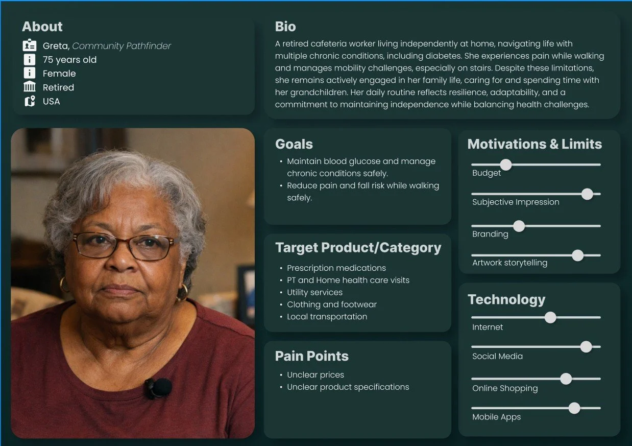
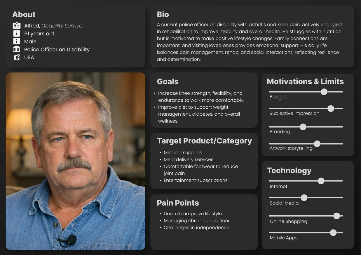
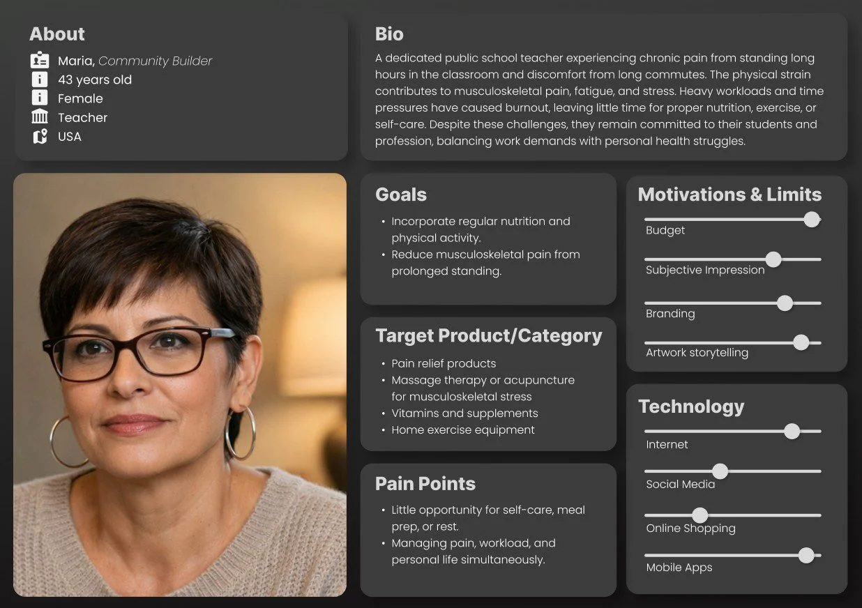
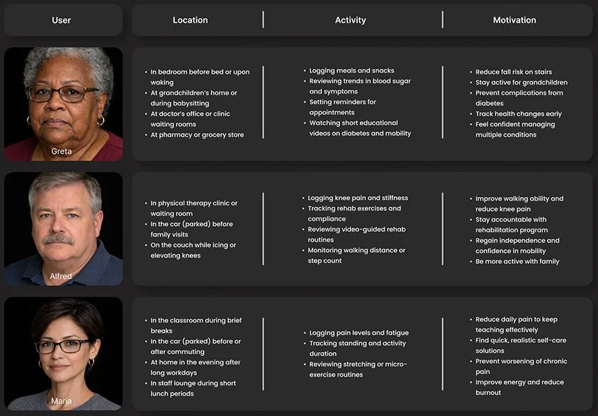
User Matrix
To better understand how and where patients would use the app, we analyzed users, locations, activities, and motivations in greater depth. The resulting user matrix helped identify key patterns and priorities, guiding design decisions and ensuring features were grounded in real-world patient contexts.
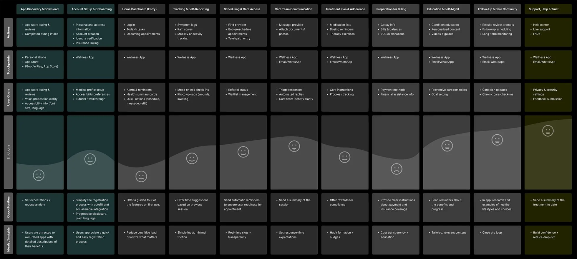
User Journey Map
This journey map captures key user interactions across segments, highlighting touchpoints, emotions, and pain points. These insights guided design priorities and helped shape solutions to reduce friction at critical moments.
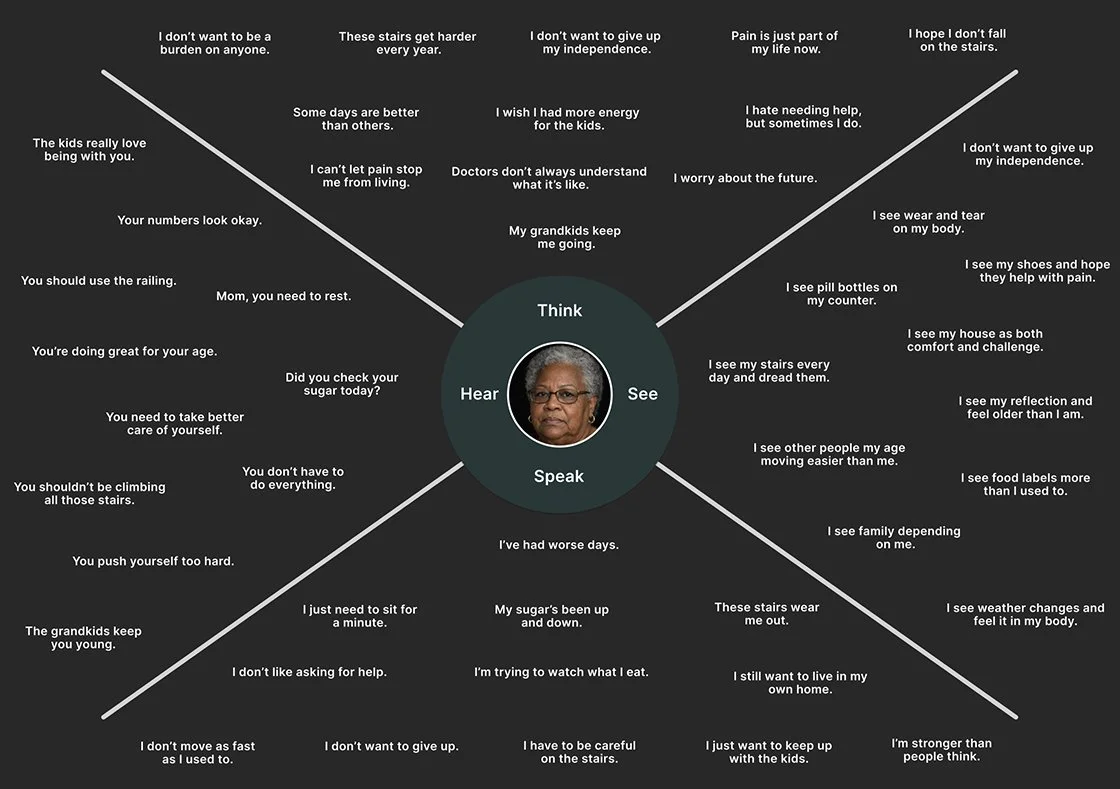
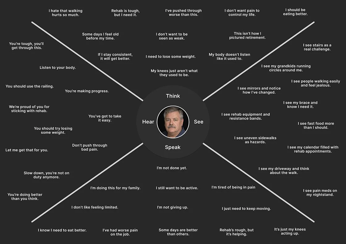
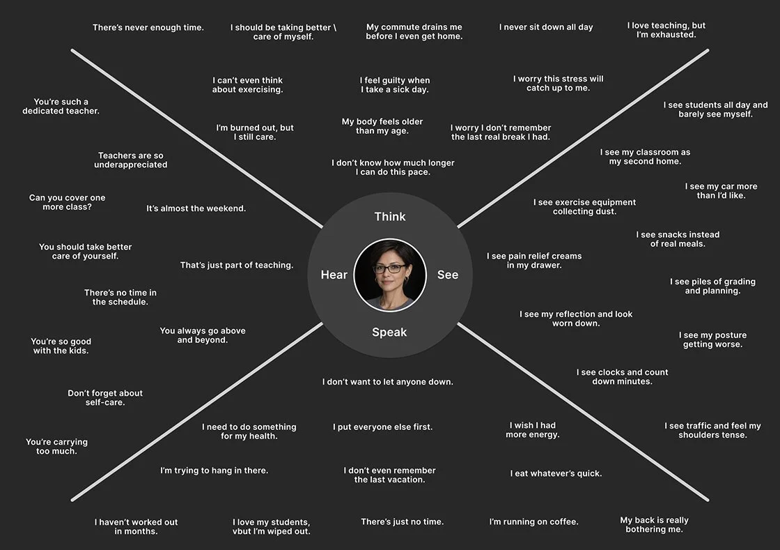
User Empathy Maps
These empathy maps synthesize user needs, thoughts, feelings, and behaviors to build shared understanding and foster empathy across the team. They clarified priorities, revealed innovation opportunities, and directly informed design decisions, shaping the process and guiding solution development toward more resonant, user-centered outcomes.
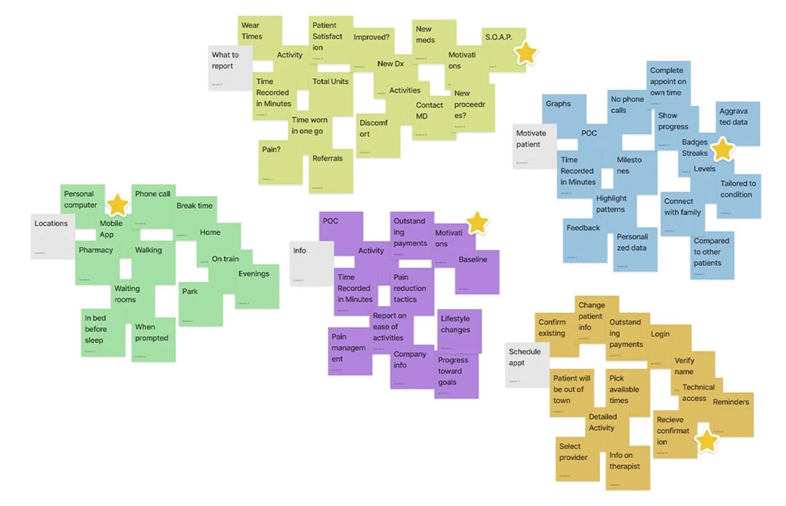
Affinity mapping
Affinity mapping was used to organize research data into key themes, enabling clearer pattern recognition and identification of user needs. These insights guided design decisions and ensured user-centered solutions, surfacing critical themes such as patient engagement, progression, re-engagement, phone scam anxiety, and respect for patients’ time.
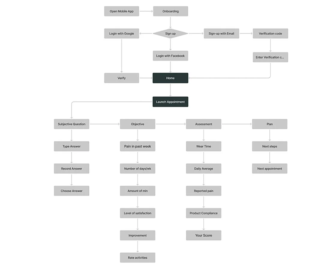
Site map
Research surfaced key innovation opportunities, including patient-focused visual data, on-the-go appointment management, dynamic scheduling, and wear-time advice. These insights guided improvements to navigation and patient engagement. The selected framework prioritized simplicity and ease of use, ensuring a more efficient and user-friendly product experience.
Responsive Paper and Lo-Fi wireframes
Exploration, ideation, experimentation, iteration, sketching, conceptualization, visualization, abstraction, adaptability, flexibility, refinement.
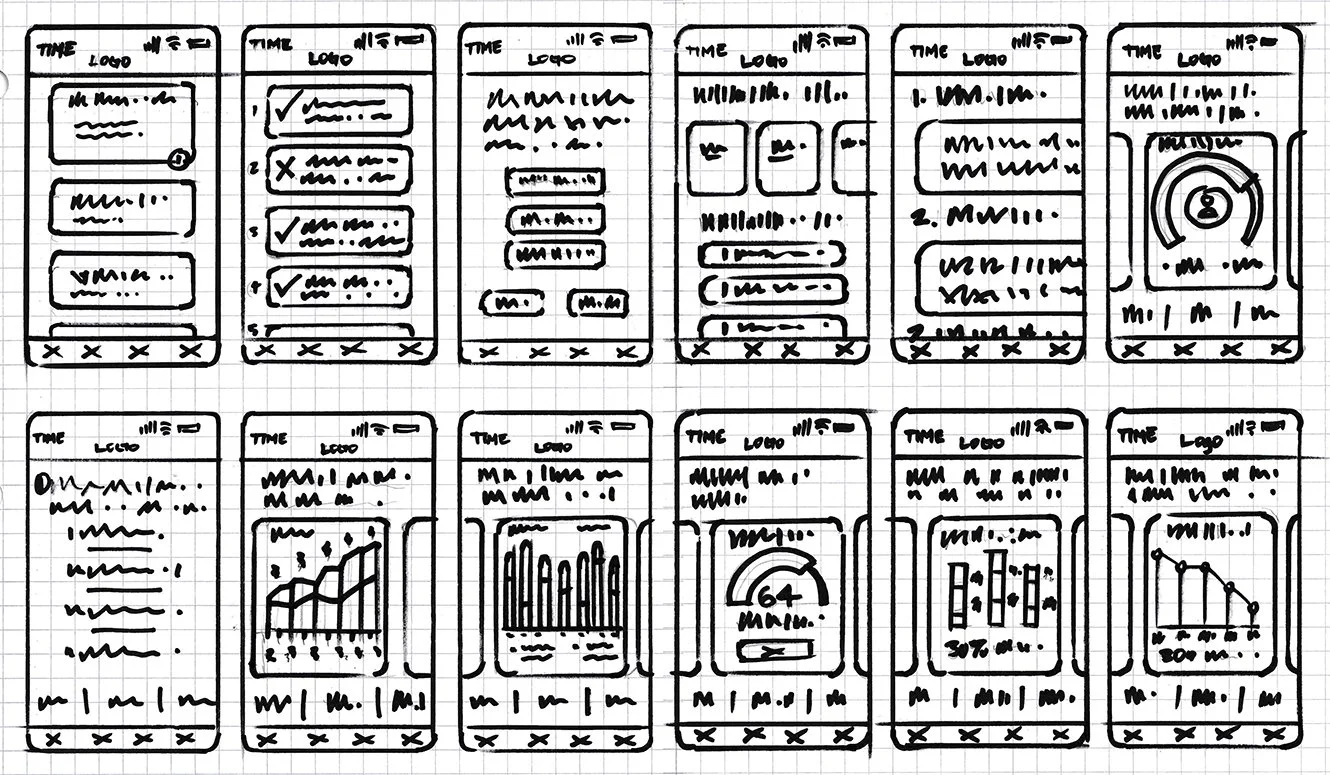
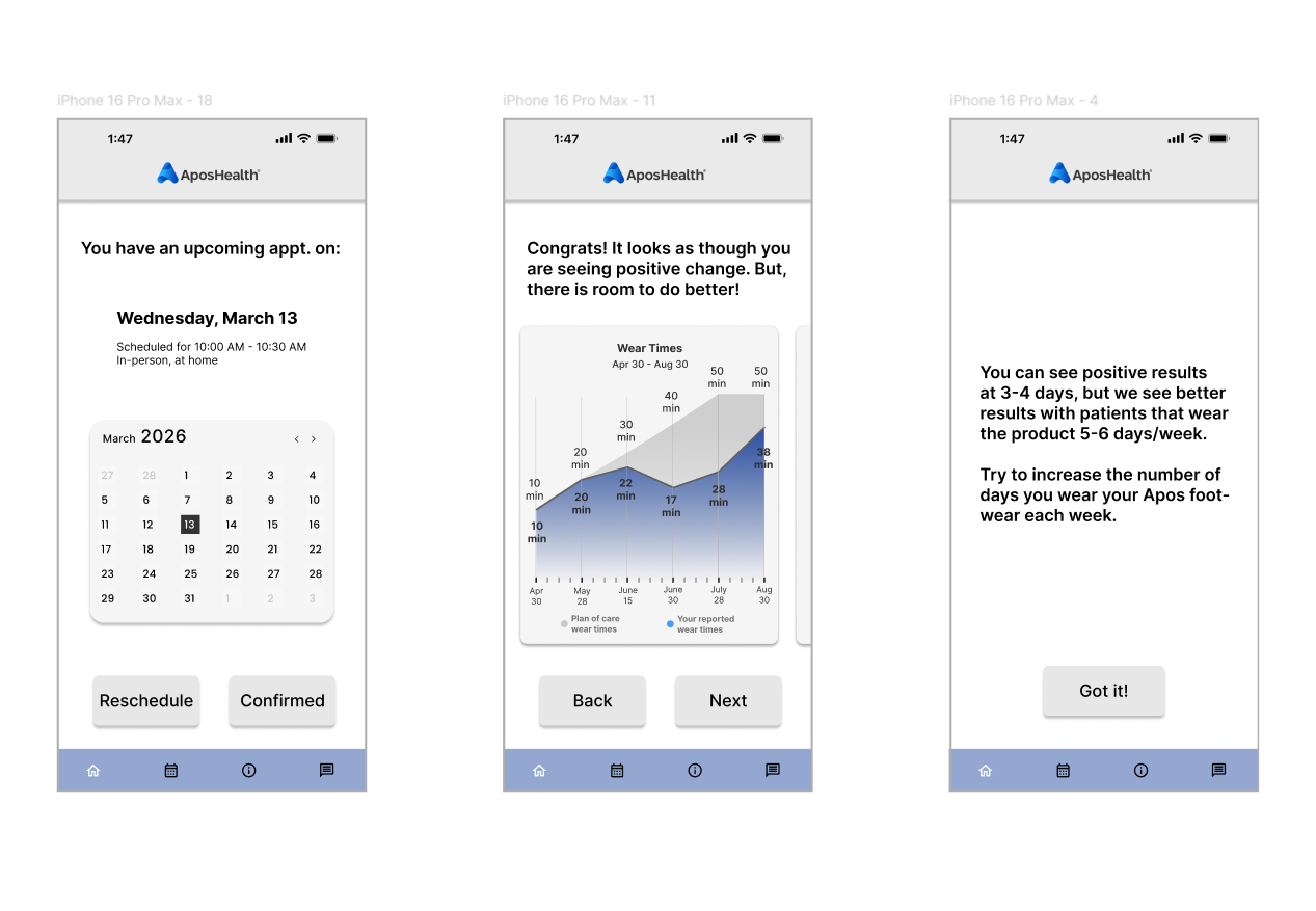
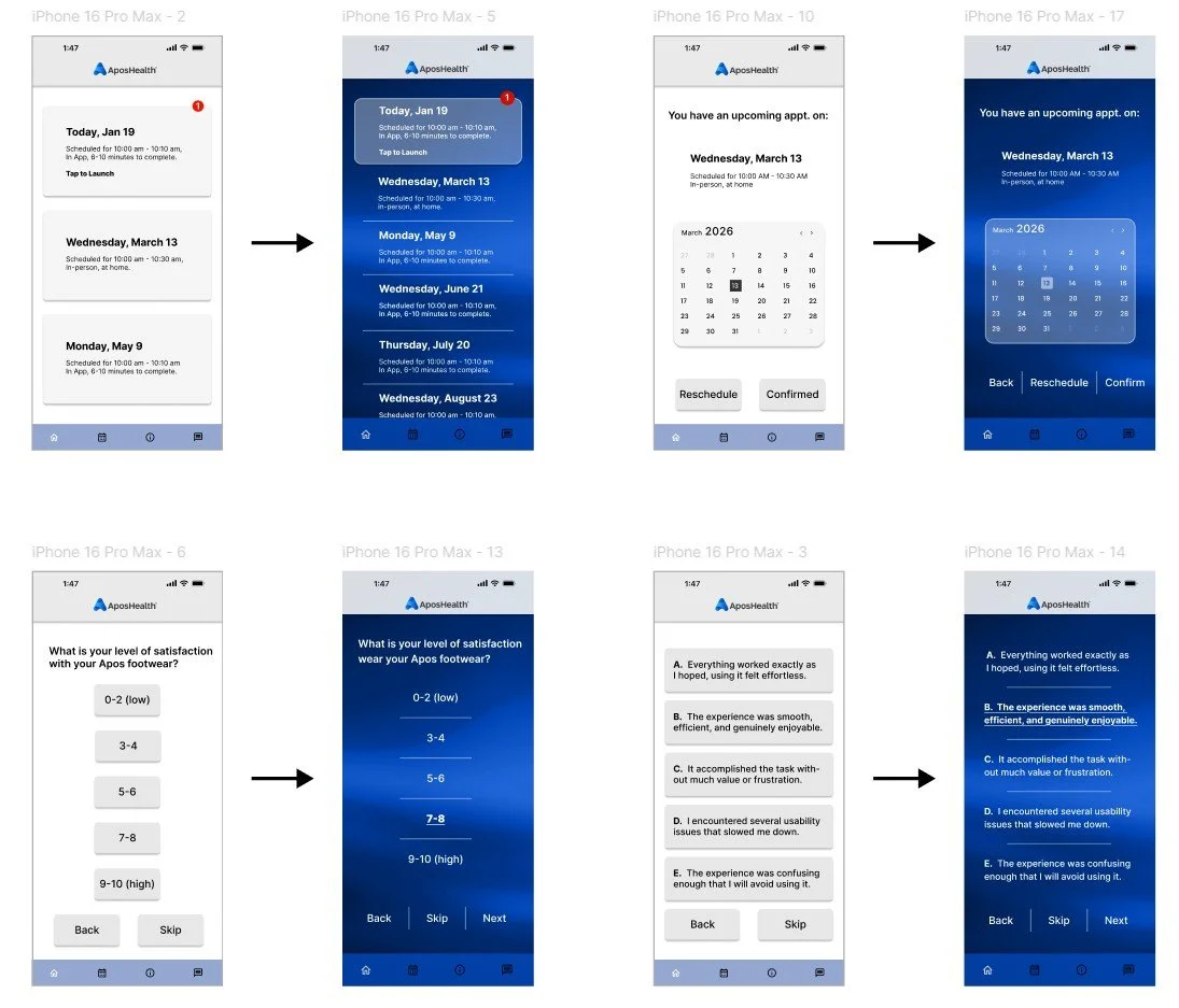
Based on user research, three features were prioritized for early digital wireframe exploration: 1) Flexible scheduling, allowing patients to choose when to complete follow-up appointments; 2) Data visualization, designed to motivate patients by showing their progress; and 3) Point-of-care education and monitoring.
Lo-Fi prototype
Models, Concepts, Feedback, Iteration, Explorations, Drafts, Experiments, Insights, Trials, Blueprints, Ideation, Revisions, Studies, Variations, Layouts, Mockups.
Usability study
User-focused, interactive, analytical, empirical, evaluative, diagnostic, iterative, insightful, systematic, detailed, thorough, informative, comprehensive, effective, user-centric.
Eight users participated in a virtual usability study, revealing three key issues:
Navigation & Flow Problems – Users disengaged in certain areas, highlighting the need for improved navigation and clearer pathways to enhance engagement and functionality.
Information Architecture Gaps – The “Upcoming Appointment” section was unclear, making it difficult for users to know where to interact.
Mental Model Mismatches – Some users’ expectations did not align with the interface; for example, multiple-choice answers lacked contextual feedback, causing users to hit the back button to verify their selections.
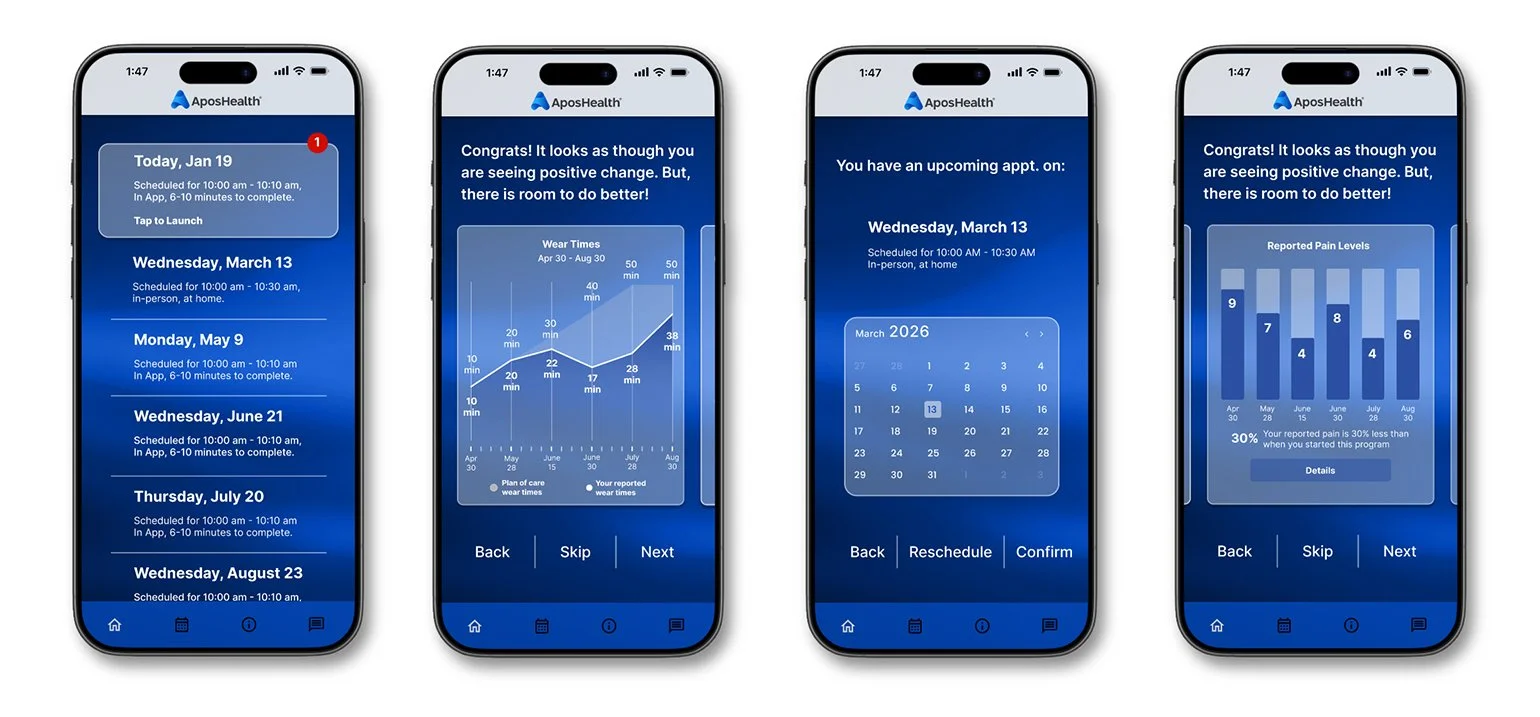
Updates to the high-fidelity prototype incorporate key insights and design refinements.
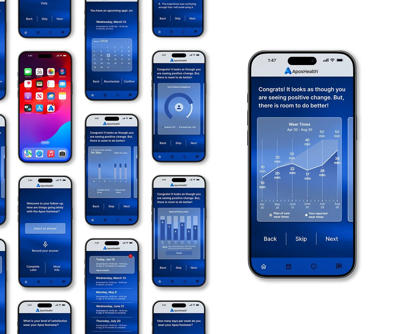
Full-size mock-up
These visuals served as key alignment tools, helping define and confirm the chosen design direction. Future screens will be built using a unified design system, ensuring consistency across patterns, typography, color, and layout.
Hi-Fi prototype
Extensive, perceptive, iterative, user-oriented, informative, evaluative, analytical, interactive, methodical, meticulous, empirical, diagnostic, user-centric, detailed, efficient.
Accessibility considerations
1. Color & Contrast: Ensured readable text and interface elements by applying sufficient contrast ratios and avoiding color-only indicators for status or errors.
2. Scalable Text: Supported dynamic type and system font resizing to accommodate low-vision users and improve readability for older adults.
3. Touch Targets: Designed large, well-spaced tap areas to reduce mis-taps and support users with limited motor precision.
4. Screen Reader Support: Provided semantic labels, logical reading order, and accessible form fields to ensure compatibility with assistive technologies.
5. Plain Language: Used clear, simple language and avoided complex medical terminology to support users with low health literacy and cognitive load.
6. Feedback & Error Recovery: Added confirmations, clear system feedback, and guided error messages to help users understand outcomes and recover from mistakes.
7. Health-Safe Interactions: Implemented safeguards for critical actions and ensured privacy, help, and support options were easy to find and access.
Next steps
1. Design Validation & Final Usability Testing: Conduct moderated and unmoderated usability testing on the hi-fi prototype to validate task success, comprehension, and error rates. Focus on critical clinical and patient safety workflows.
2. Accessibility Audit & Remediation: Run formal accessibility reviews (WCAG 2.1 AA) and test with screen readers, keyboard navigation, and low-vision users. Address any gaps before development handoff.
3. Clinical & Compliance Review: Review designs with clinical, legal, and compliance stakeholders to ensure accuracy of medical content, patient safety, HIPAA considerations, and regulatory alignment.
4. Design System & Component Finalization: Finalize UI components, tokens, and patterns in Figma to support scalable development and long-term consistency
5. Developer Handoff & Specifications: Prepare redlines, interaction notes, edge cases, and responsive behaviors. Use Figma Dev Mode or equivalent for clear engineering handoff.
6. Pilot / MVP Build: Support engineering during initial implementation and validate that the built product matches design intent through design QA.
7. Post-Build Validation & Iteration: Test the working MVP with real users and stakeholders, collect metrics, and iterate based on real-world usage and feedback.