
Athena Health Task Flow
Redesigning the “multiple patient task flow” to maximize speed and efficiency by introducing customizable sorting filters and dedicated tabs for each patient EMR.
Process
This project focuses on a specific segment of the overall EMR experience: preparing for multiple patients. It began with understanding setup challenges through research, followed by rapid ideation and visualization. Potential solutions were explored through prototyping, validated through user testing, and refined through iterative feedback cycles.
The problem
Clinicians manage overwhelming schedules with little to no time between patients. Redefining the “start of the shift” task aims to ease the burden of documentation. Session notes are a critical component of the EMR, yet they are often left incomplete at the end of a visit. Improving the note-taking workflow and allowing clinicians to return and finalize documentation later enables healthcare professionals to focus more fully on patients and outcomes while maintaining accurate, thorough session records.
My role
Lead UX designer, UI designer, UX researcher, Brand designer, Graphic designer, Product designer, and technical writer.
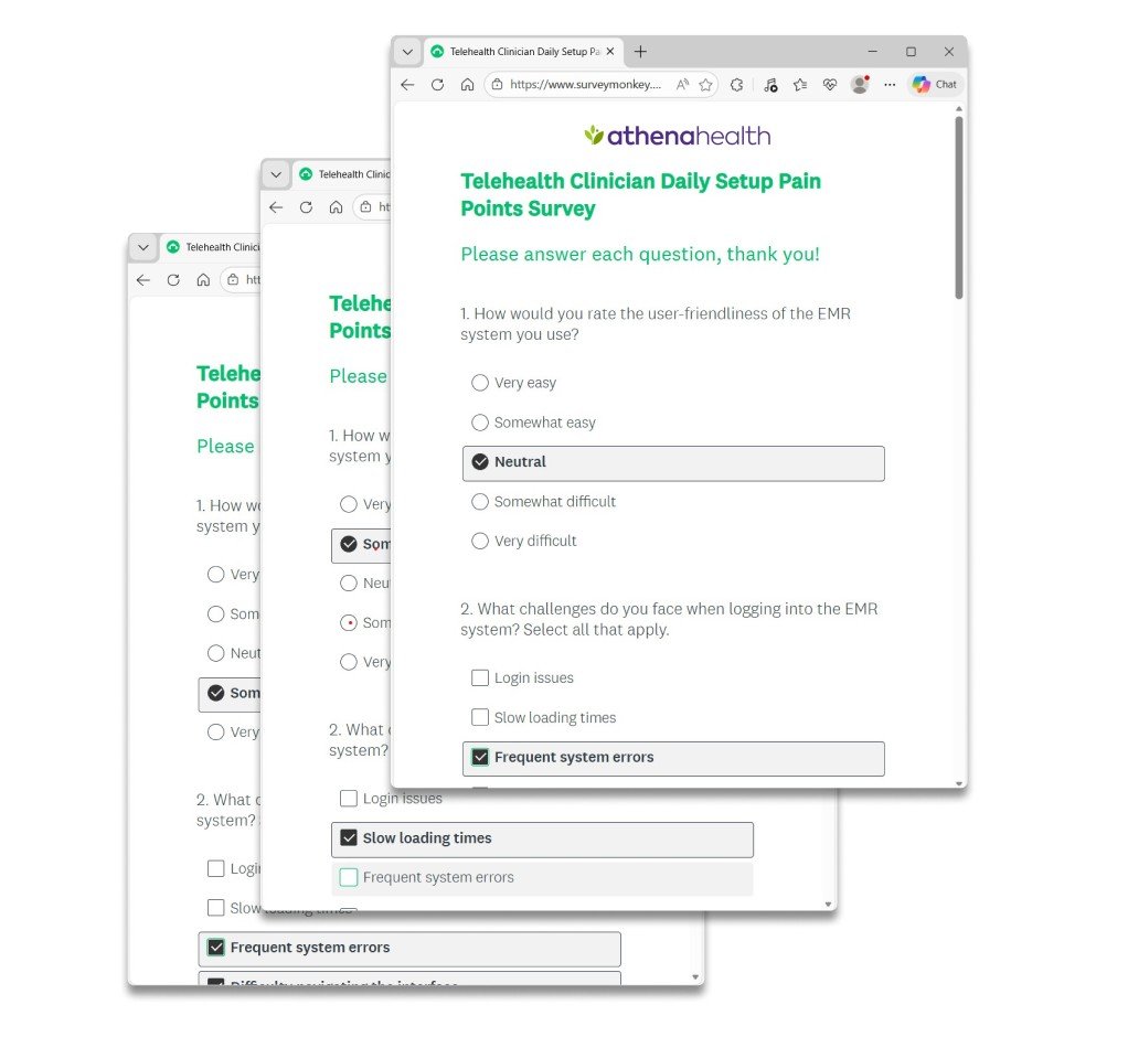
Mixed-methods research
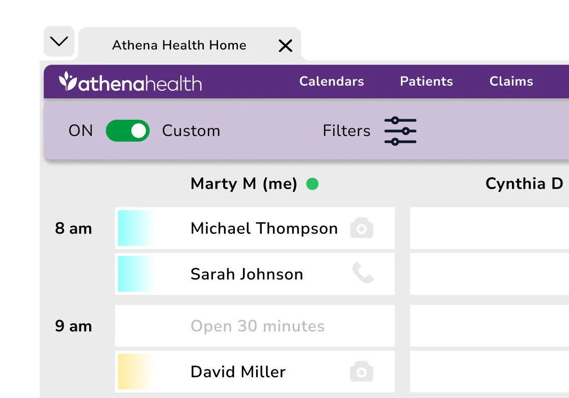
Research began with a quantitative SurveyMonkey questionnaire emailed to participants, followed by qualitative phone interviews. This approach revealed user behaviors, uncovered key themes, and measured overall satisfaction. A notable insight was the recurring pattern of clinicians using multiple tabs to manage and organize their upcoming appointments.
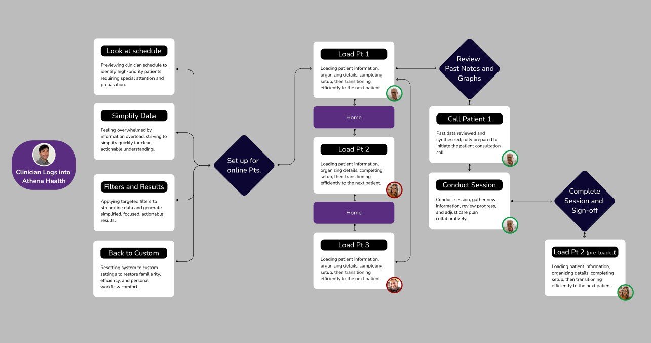
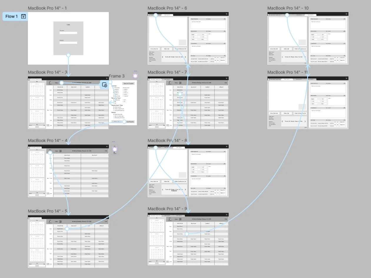
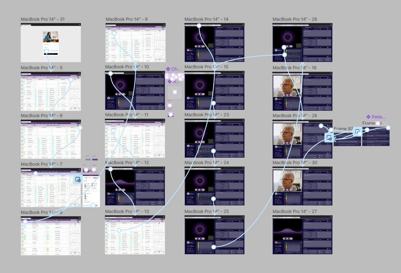
Task Flow
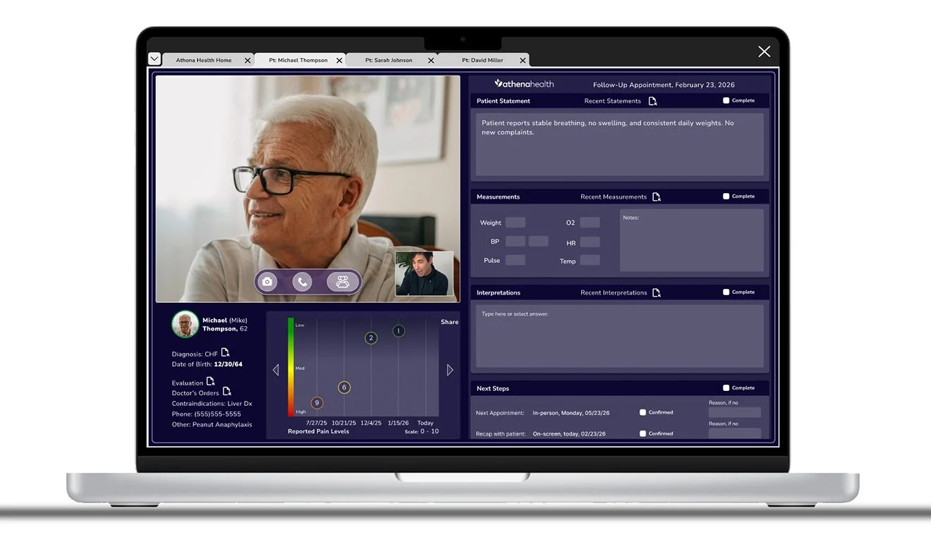
Early in the project, the multiple-patient task flow was redefined to better support how clinicians prepare for upcoming visits. Clarifying key steps and decision points created a more intuitive, repeatable sequence that reduces cognitive load and improves speed. Structured tab navigation allows quick transitions between patients while keeping information clearly separated, reinforcing accuracy, organization, and overall efficiency.
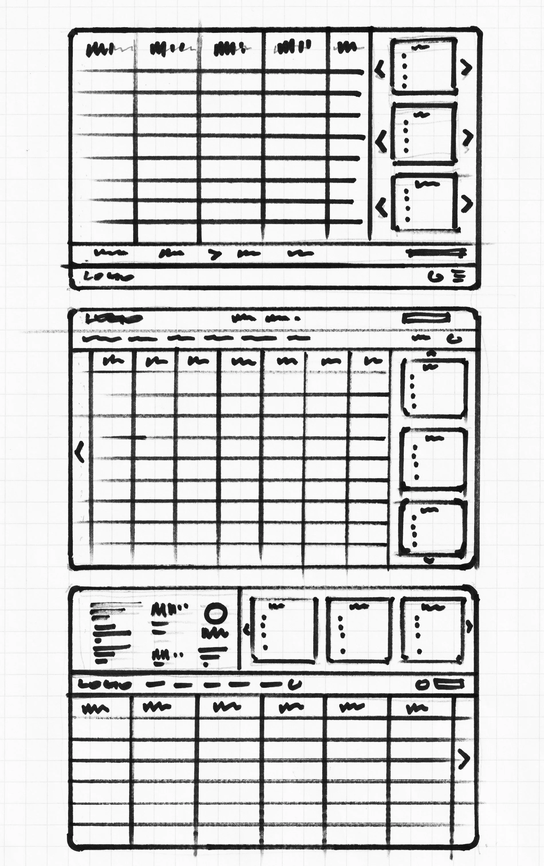
Responsive Paper and Lo-Fi wireframes
Initial concepts, sketches, layout drafts, basic visual representations, exploration, ideation, simplicity, flexibility.
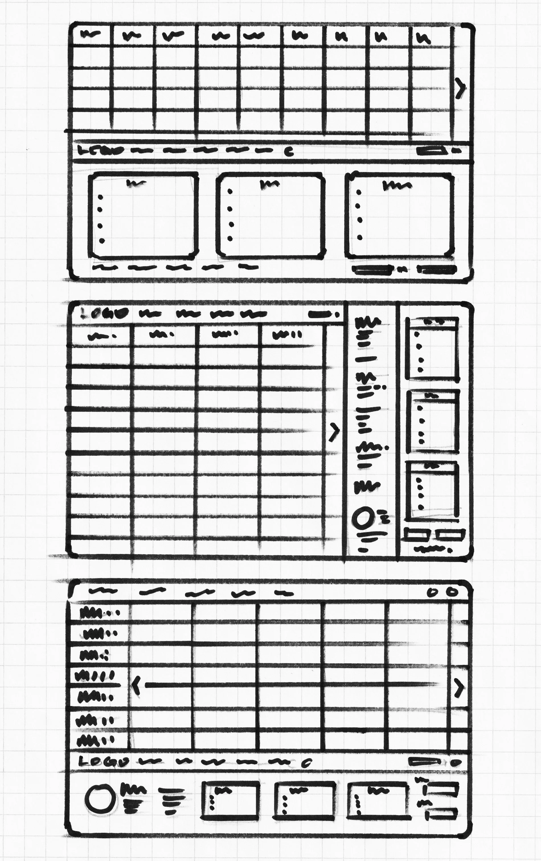
Lo-Fi prototype
Initial sketches, early concepts, basic models, preliminary layouts, user insights, iterative refinement, and foundational designs.
Usability study
Thorough, analytical, user-centered, iterative, data-driven, evaluative, systematic, diagnostic, insightful, detailed, research-based, informative, effective, and thoughtfully refined.
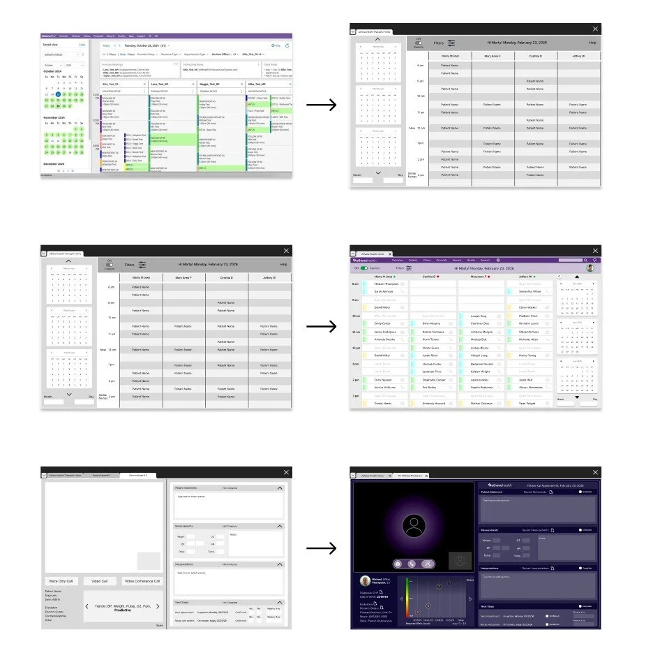
The mixed-methods study revealed four key issues: 1. navigation difficulties with excessive clicks and chart switching, 2. high cognitive load from overwhelming information, telehealth-specific gaps including 3. Unclear calls to action caused hesitation, particularly when primary actions were not visually distinct, and 4. efficiency breakdowns such as repetitive actions and minimal customization. The high-fidelity prototype was updated accordingly, refining design elements to align with project requirements and user feedback.
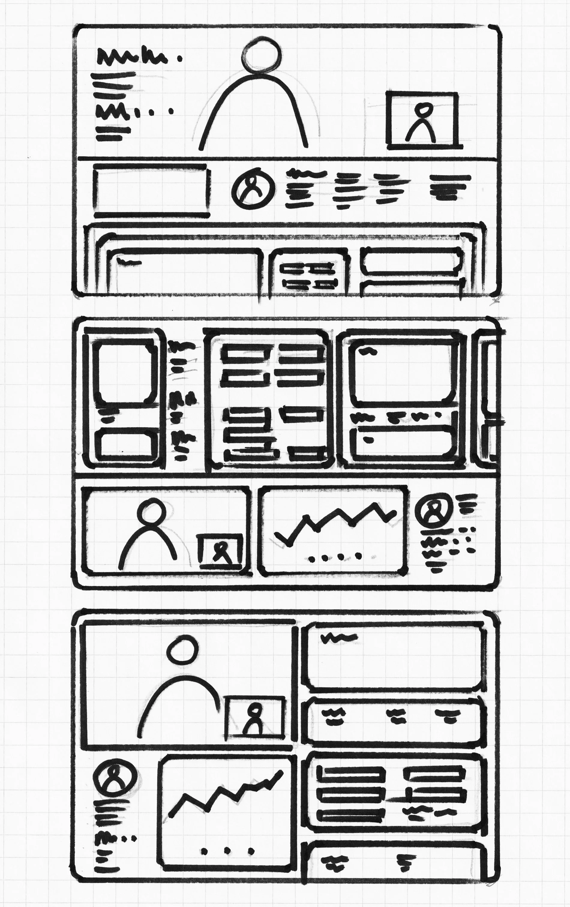
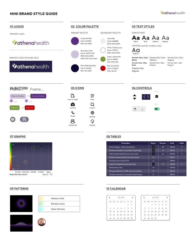
Brand Style Sheet/Guide
This brand style was developed to define the visual and verbal identity, ensuring consistency across platforms. It guides typography, colors, logos, imagery, and layout, communicates brand tone, improves efficiency, and supports scalable, cohesive design, helping all materials reflect the brand professionally and maintain a unified, recognizable presence.
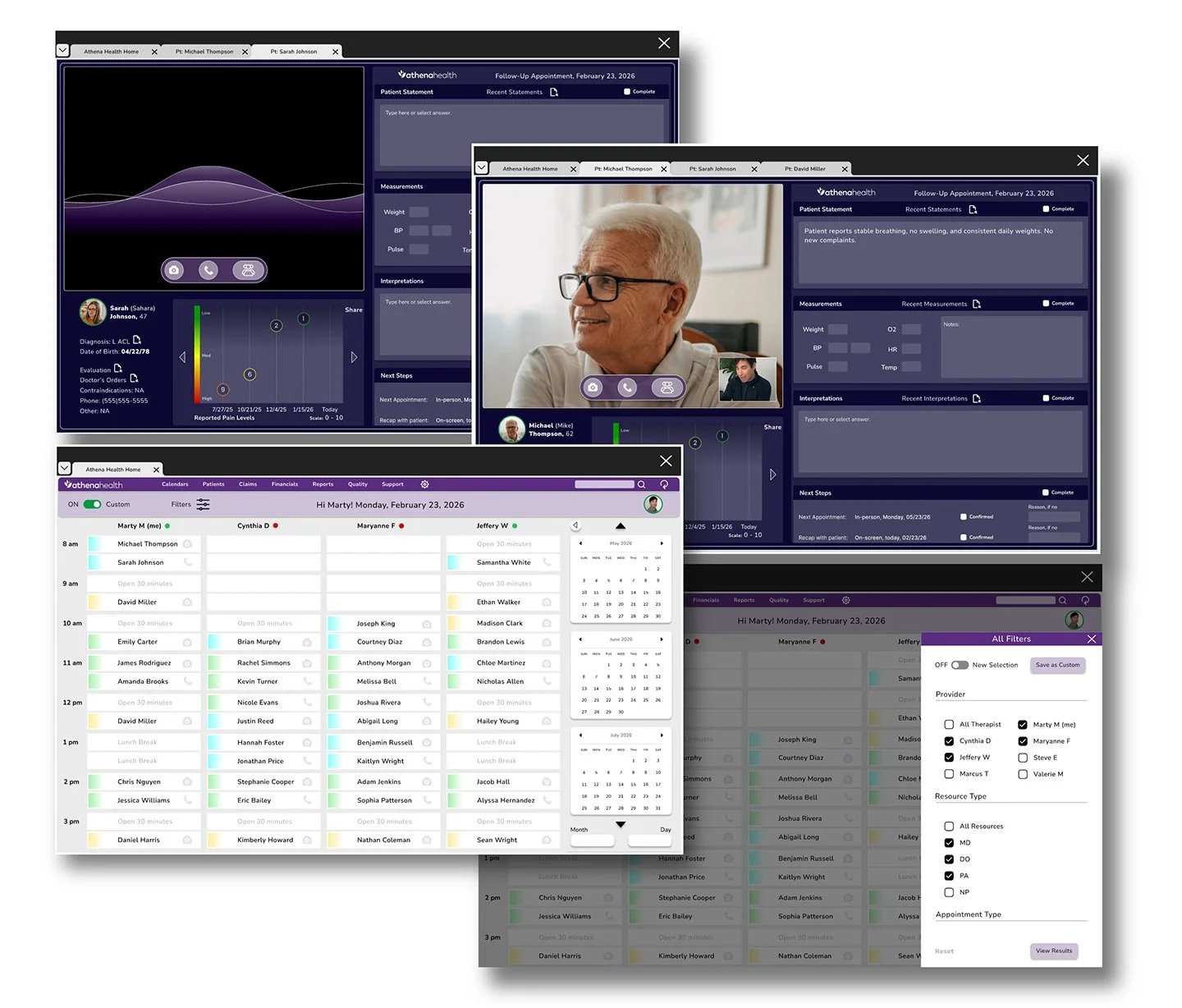
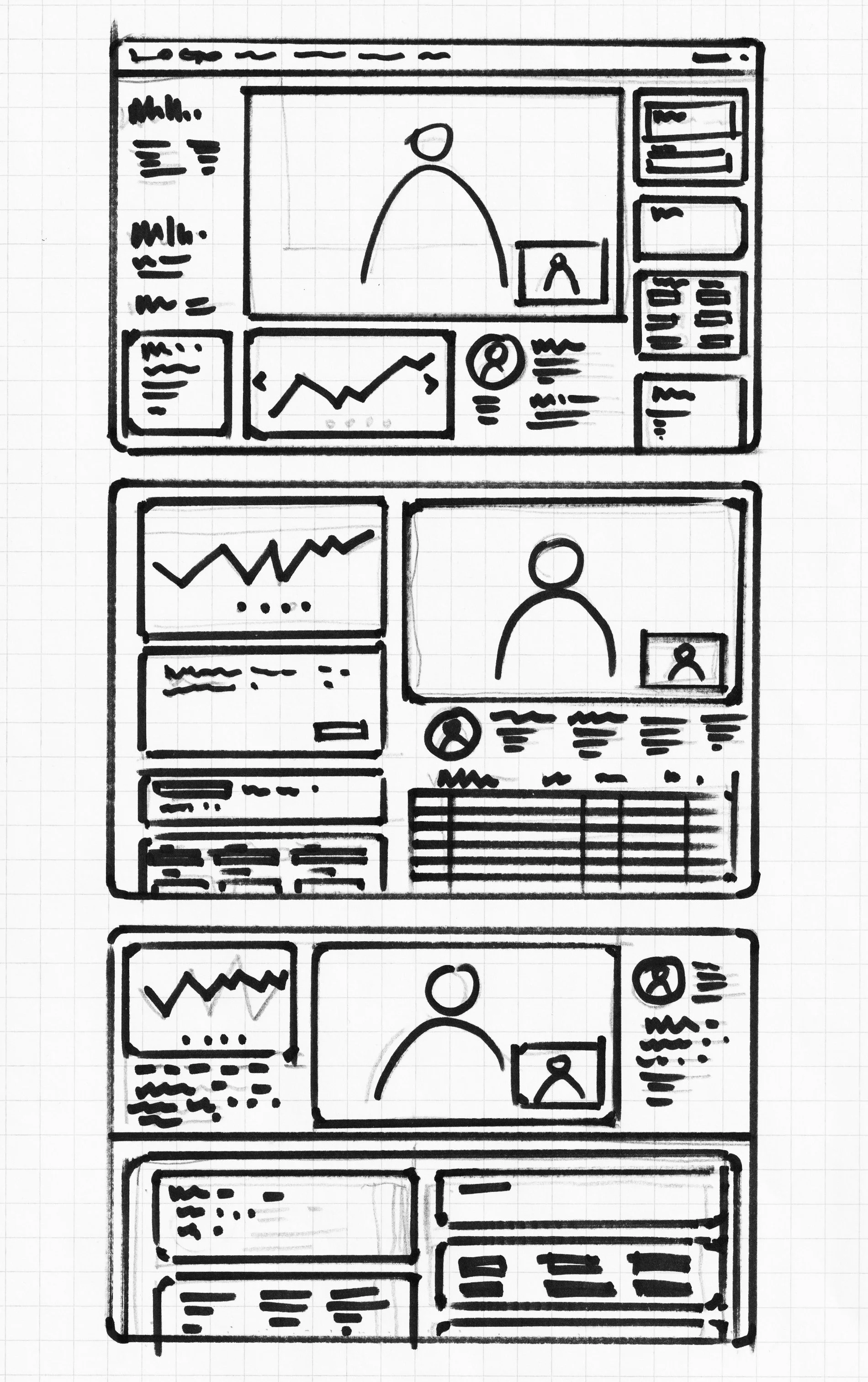
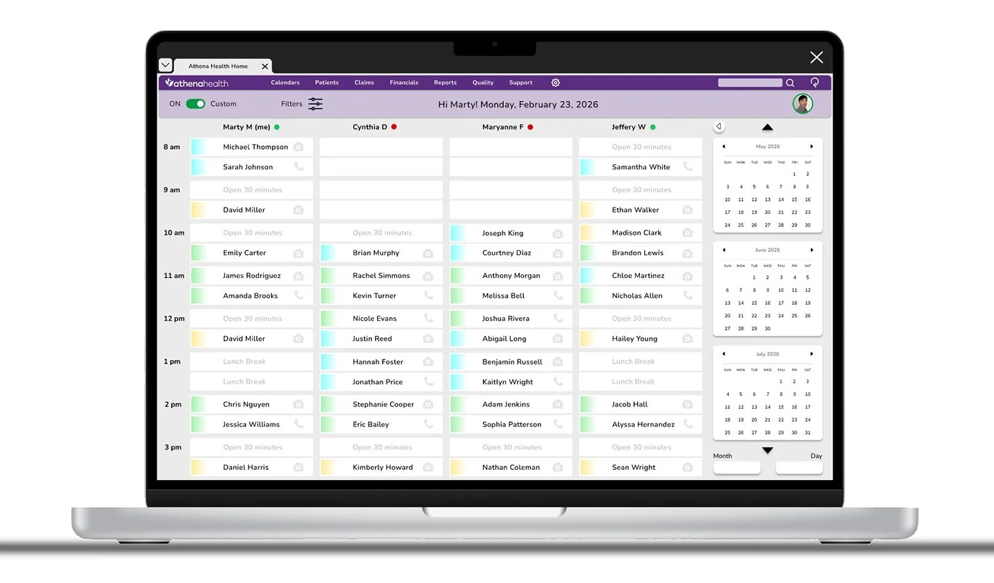
Full-size mock-up
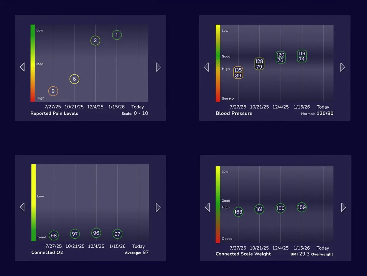
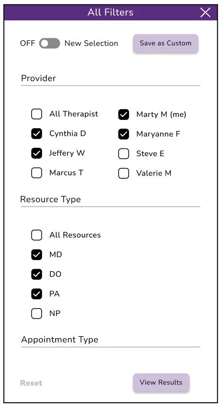
The final design solution is taking shape, and these visuals helped clarify and solidify the overall direction. Subsequent screens follow a cohesive design system, applying consistent patterns, typography, color palettes, and layout structure. Key themes include customizable filters, market-based color coding, light and dark modes, and the ability to mark segments as complete.
Hi-Fi prototype
Extensive, perceptive, iterative, user-oriented, informative, evaluative, analytical, interactive, methodical, meticulous, empirical, diagnostic, user-centric, detailed, efficient.
Accessibility considerations
1. Screen Reader Compatibility: Ensure all content, including patient data and controls, is readable by screen readers.
2. Keyboard Navigation: All functionality should be accessible without a mouse, supporting tabbing and shortcut keys.
3. Color Contrast: Use sufficient contrast for text, icons, and alerts to aid users with visual impairments.
4. Text Scaling & Zoom: Allow adjustable font sizes without breaking layouts or hiding content.
5. Clear and Consistent Labels: Buttons, forms, and controls should have descriptive labels for clarity.
6. Error Identification & Instructions: Provide accessible error messages and guidance for correcting inputs.
7. Avoid Reliance on Color Alone: Use icons, patterns, or text alongside color cues to convey information.
8. Accessible Alerts & Notifications: Ensure pop-ups, modals, or alerts are perceivable and operable for all users.
Next steps
1. Analyze Usability Study Results: Review findings, identify patterns, pain points, and areas for improvement.
2. Prioritize Design Changes: Rank issues by severity and impact to decide what to address first.
3. Iterate on the Prototype: Refine the design based on feedback and usability insights.
4. Validate Updates: Conduct follow-up testing or A/B tests to confirm improvements.
5. Document Design Decisions: Record rationale for changes, patterns, and guidelines for consistency.
6. Prepare Developer Handoff: Organize assets, specs, and interactions for engineering teams.
7. Update Design System: Incorporate new components, patterns, or styles discovered during iteration.
8. Plan Implementation & Monitoring: Coordinate rollout, track usage, and gather post-launch feedback for future refinements.
Takeaways
1. Impact: Redesigning the EMR task flow improved efficiency by reducing clicks and repetitive actions, simplifying navigation, and lowering cognitive load. Telehealth workflows, customizable filters, and flexible note-taking enhanced usability, while iterative testing ensured the design met clinician needs.
2. What I Learned: From redesigning the EMR “multiple patient task flow”, I learned that minimizing clicks and organizing patient charts clearly significantly improves clinician efficiency. Observing clinicians using the EMR firsthand provided critical insights into real workflows, pain points, and workarounds. Supporting telehealth workflows, offering customization, and enabling flexible notetaking are essential, while iterative testing and user feedback validated effective design solutions.