
MyRiches a Mindful Spending Guide
A new consumer app that improves buying decisions in real time, using Behavioral Economics and decision frameworks to guide more intentional, confident spending choices.
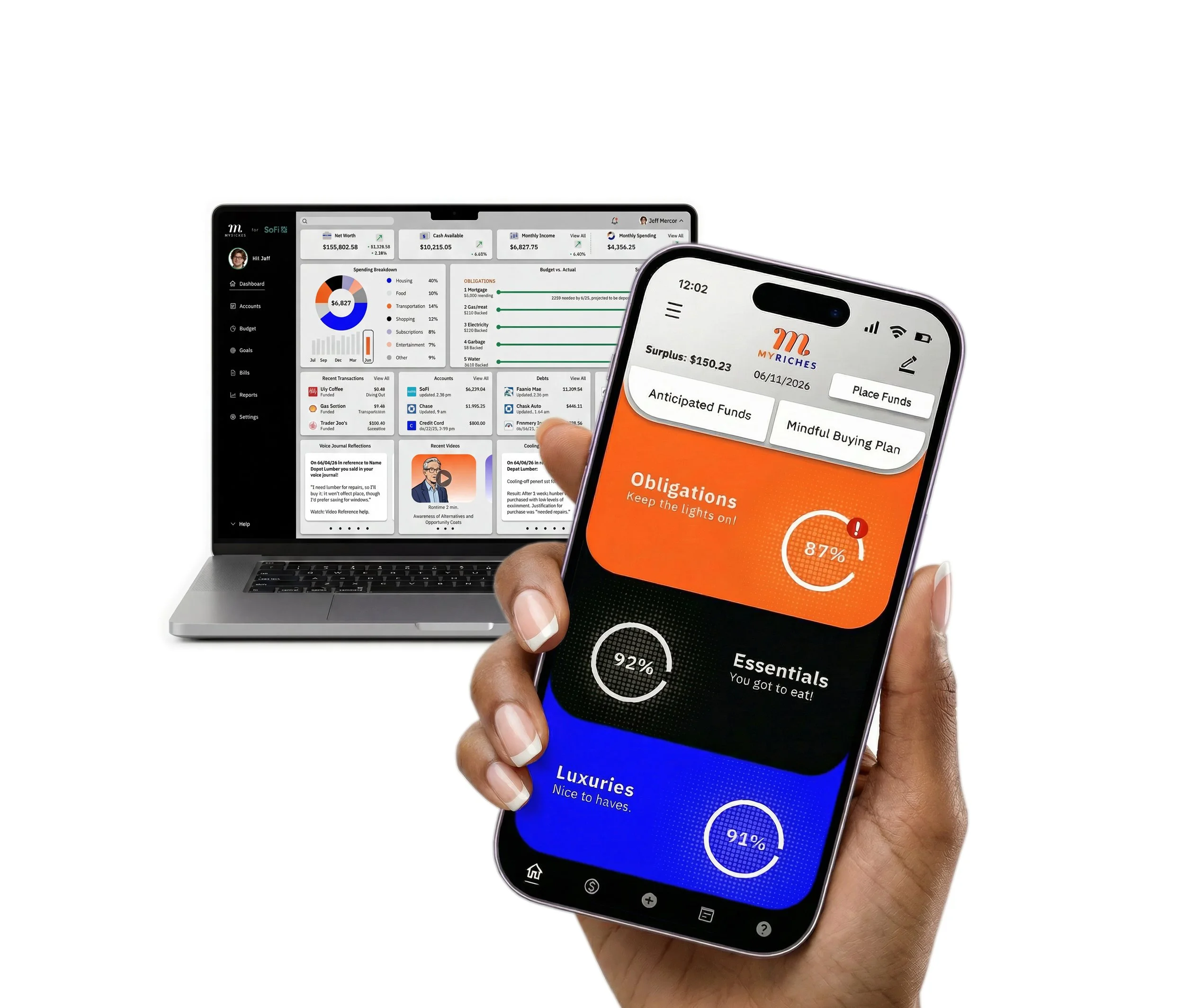
View: MyRiches Hi-Fi Prototype
Process
The process began by exploring the need for real-time support at the moment of purchase. It was grounded in research to understand the problem, followed by rapid ideation and visualization, solution exploration through prototyping, user feedback through testing, and continuous refinement through iterative cycles.
The problem
Consumers often make fast, emotionally driven purchase decisions without accessing or applying their financial plans in the moment. Existing tools emphasize retrospective insights rather than real-time support, failing to translate financial data into clear actions, reinforce long-term goals, or guide users through structured decision-making at the point of purchase.
My role
Lead UX designer, UI designer, UX researcher, Brand designer, Graphic designer, Product designer, and Technical writer.
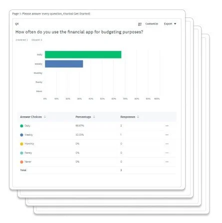
Mixed-methods research
Research began with a quantitative SurveyMonkey questionnaire emailed to participants, followed by qualitative phone interviews. This approach surfaced key behaviors, revealed recurring themes, and assessed overall satisfaction. A critical insight showed users benefit more from real-time feedback than retrospective insights, as purchase decisions are often fast and emotionally driven rather than analytical.
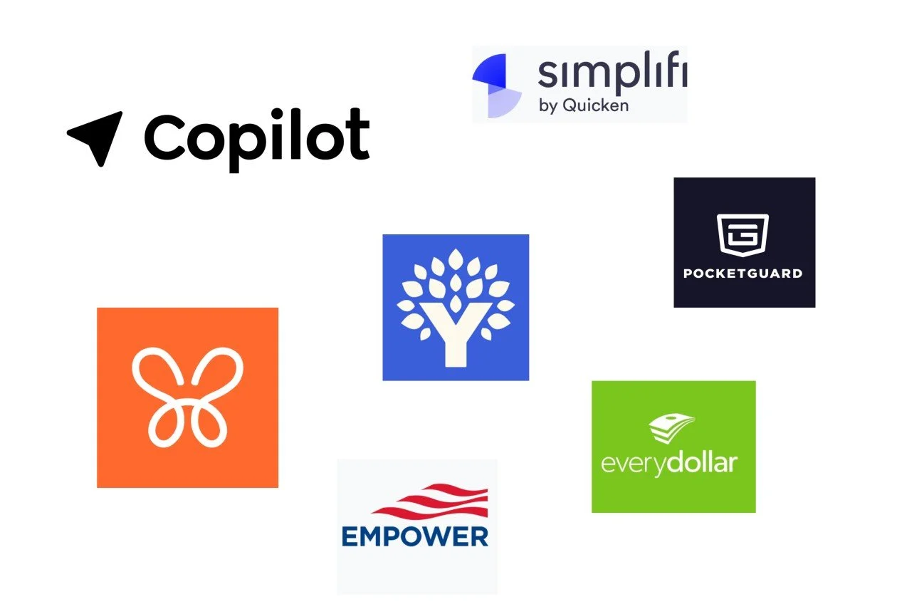
Competitive analysis
Competitive analysis informed the design of the new financial app by identifying gaps, benchmarking features, and revealing strengths and weaknesses in existing solutions. These insights shaped differentiation, prioritized user needs, and guided more effective, user-centered product decisions and overall experience strategy.
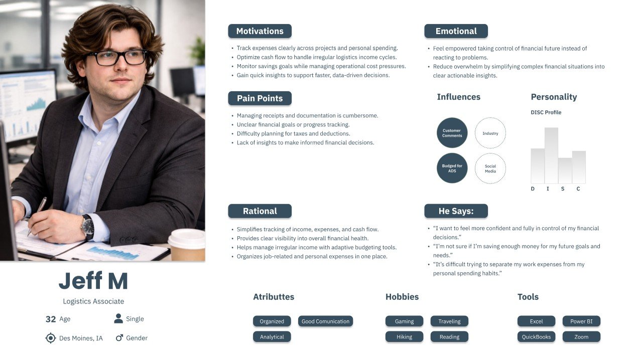
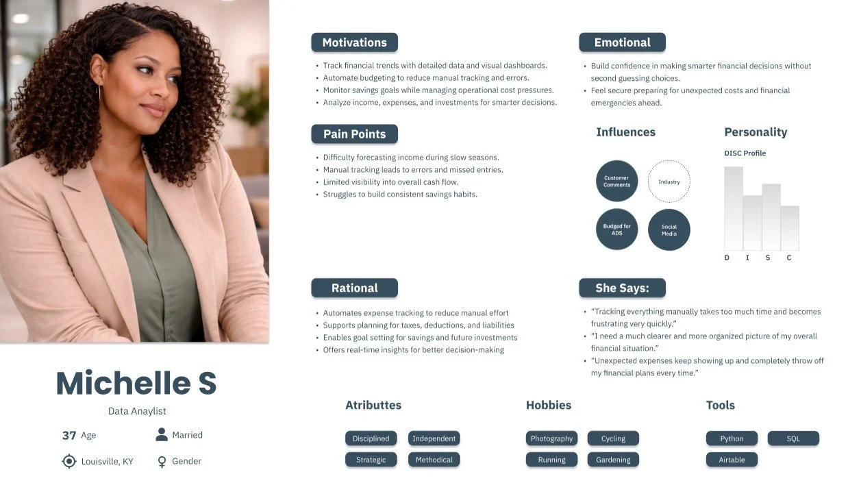
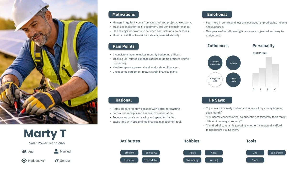
Exploring user empathy
Awareness, empathy, perspective, meaningful connection, emotional drivers, underlying motivations, user needs, aspirations, lived experiences, situational context, key challenges, and clear communication.
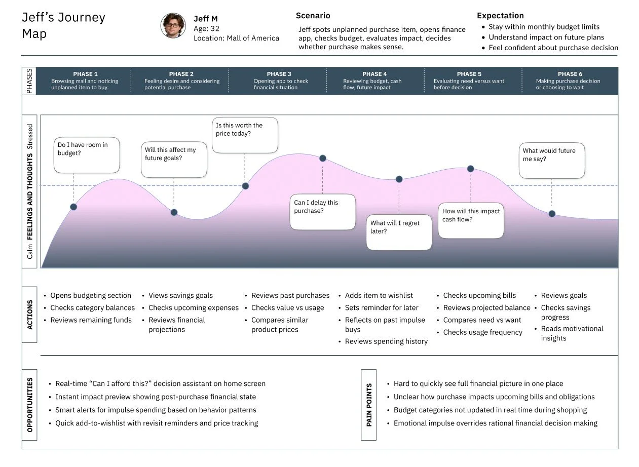
User journey map
Designed to provide a thorough understanding, this journey map illustrates a persona’s diverse interactions with the product during a scenario, emphasizing key touchpoints, emotional responses, actions, opportunities, and pain points throughout their experience.
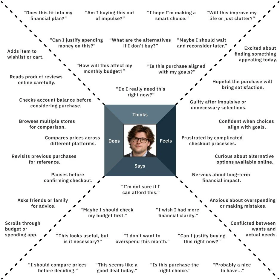
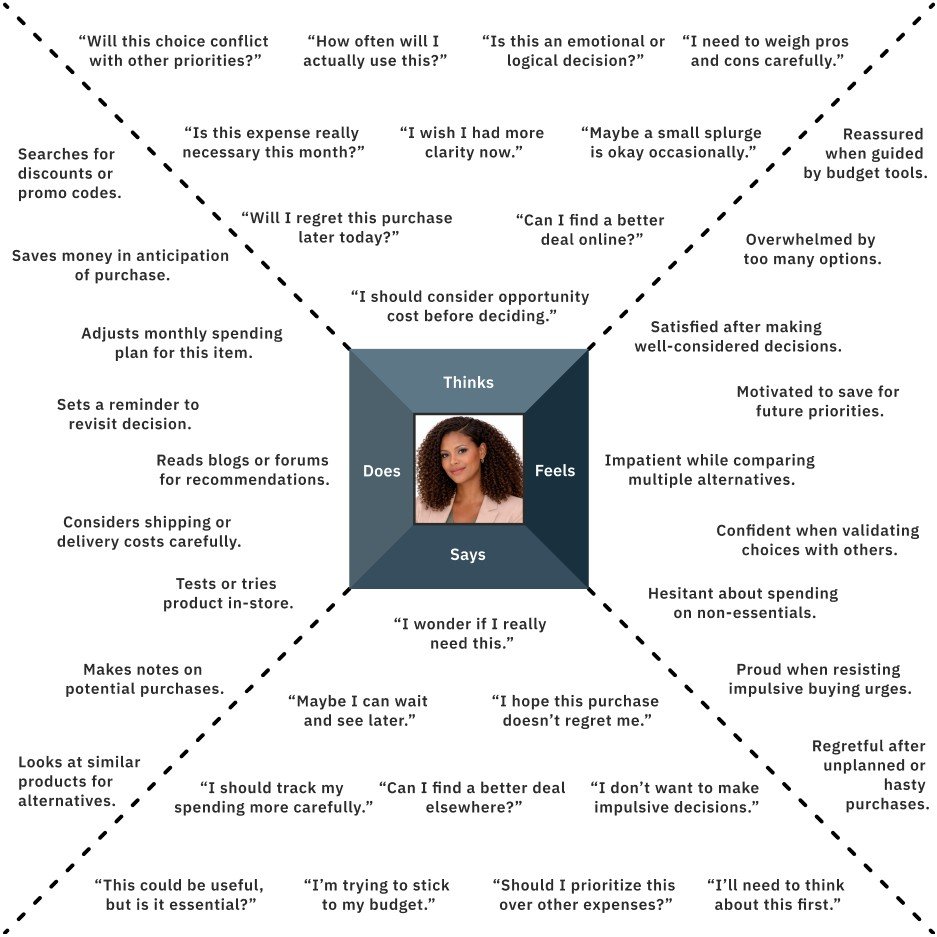
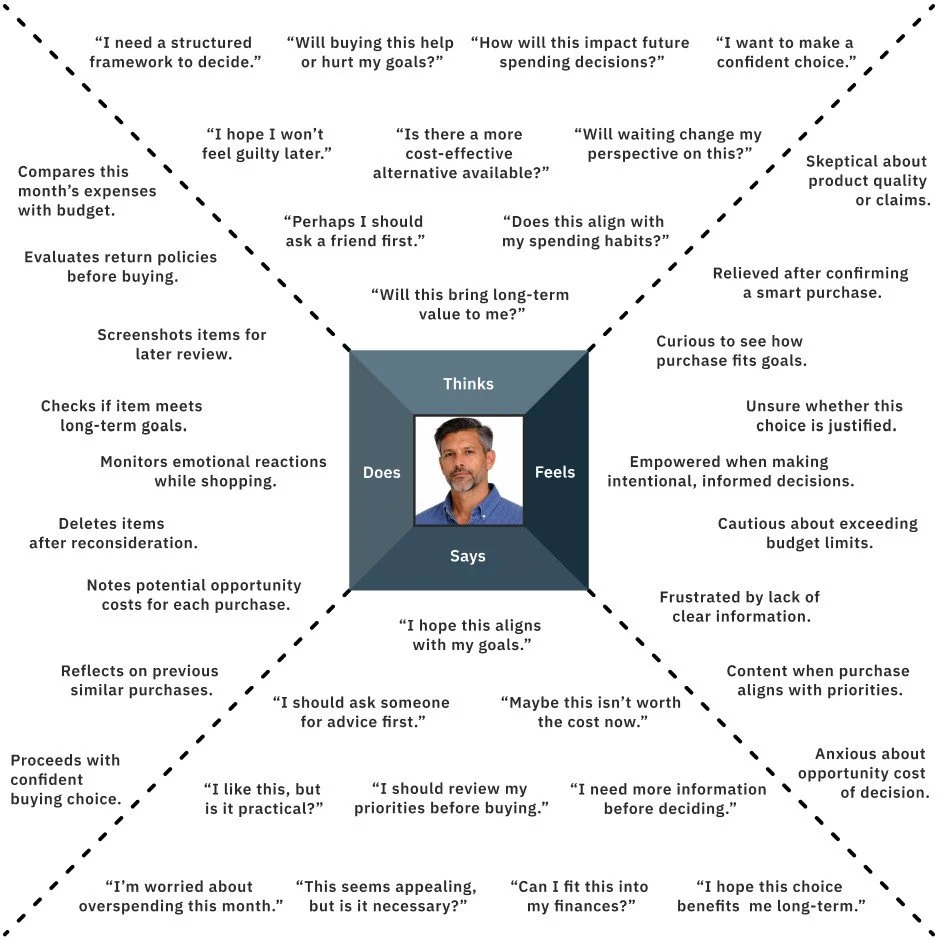
User Empathy Maps
Within this case study, empathy maps were used to distill user needs, thoughts, emotions, and behaviors into a clear understanding of the experience. They highlighted priorities, uncovered opportunities for innovation, and informed key design decisions, guiding the process toward more effective, user-centered solutions.
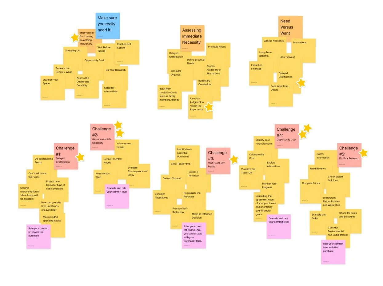
Affinity mapping
Using affinity mapping helped cluster research data into clear themes, revealing patterns and identifying user needs that informed design decisions. This method supported user-centered outcomes, surfacing key areas such as behavioral insights, decision gaps, and underlying psychological patterns.
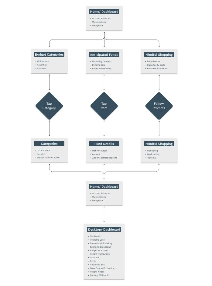
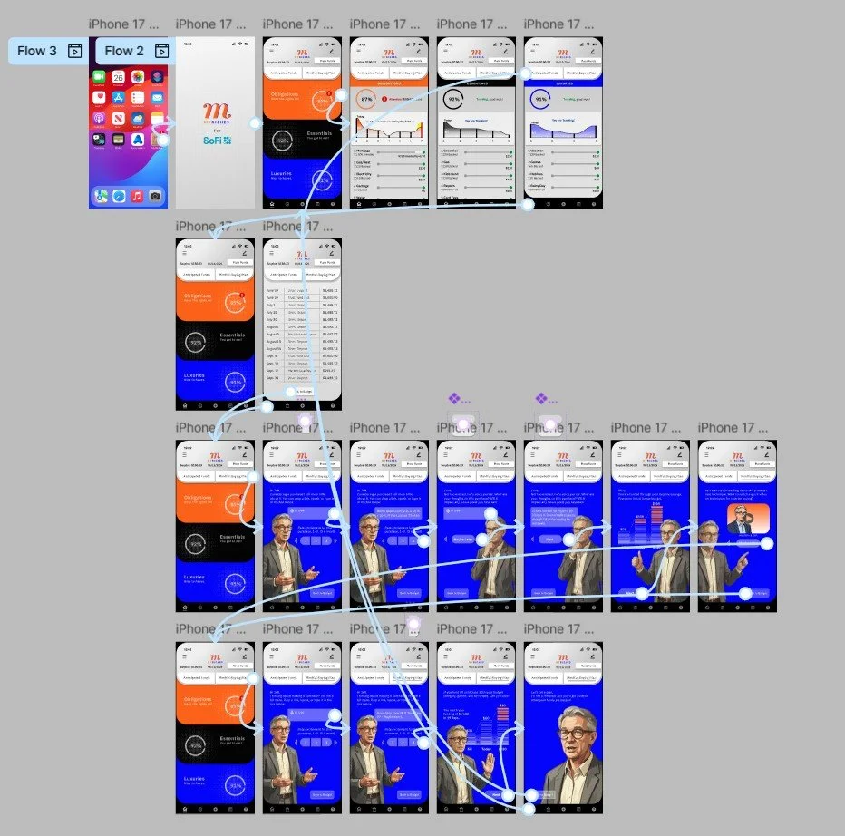
Task Flow
Early in the project, the task flow was restructured to better accommodate the psychological demands of purchasing. By clarifying key steps and decision points, a more intuitive and repeatable sequence was established, reducing cognitive load and increasing efficiency. This streamlined flow influenced the final UX by keeping interactions grounded, maintaining simplicity as a reference point throughout the experience.
Responsive Paper and Lo-Fi wireframes
Early ideas, rough sketches, layout explorations, simple visual studies, concept development, iterative thinking, adaptable structure, minimal design.
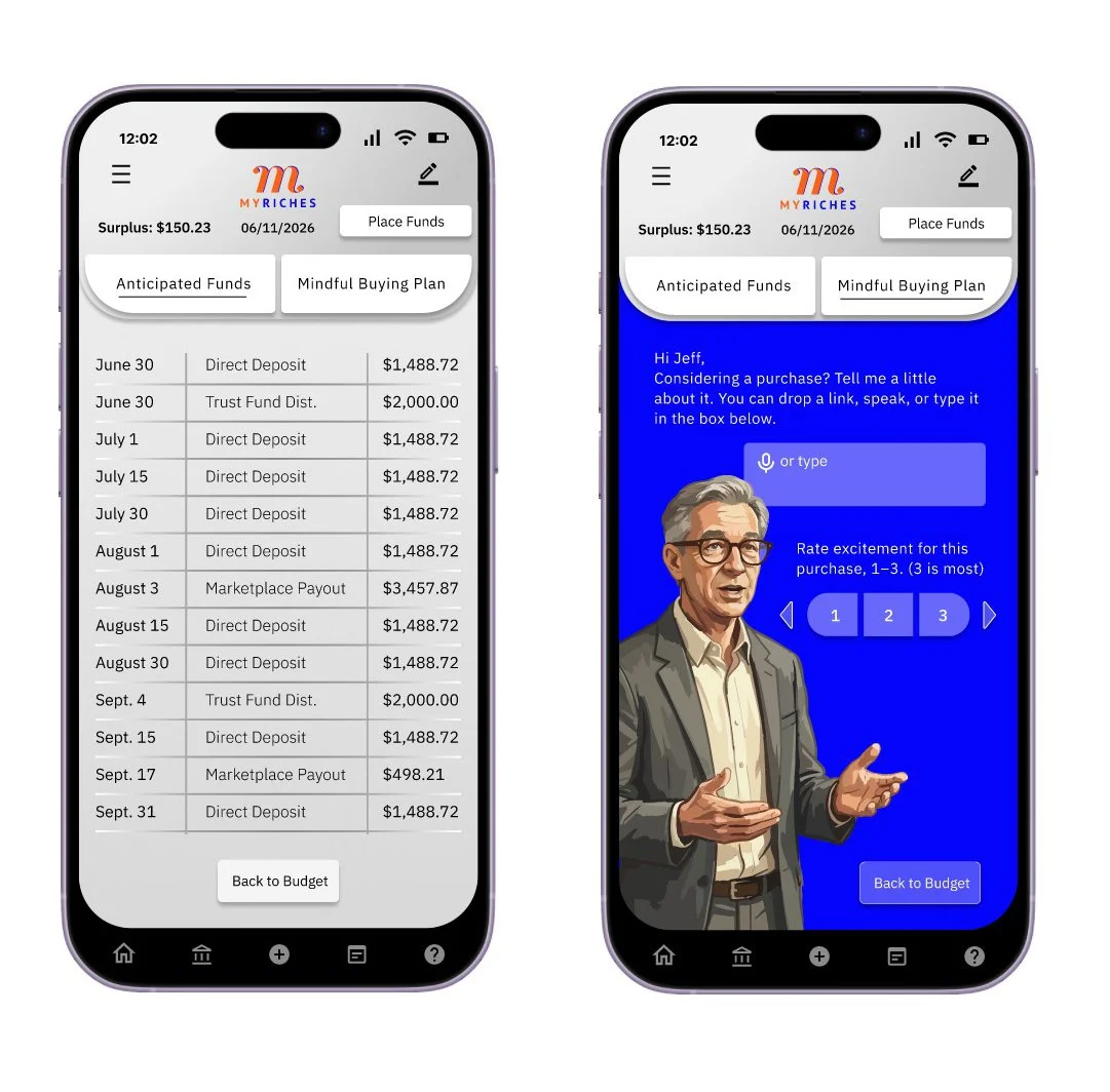
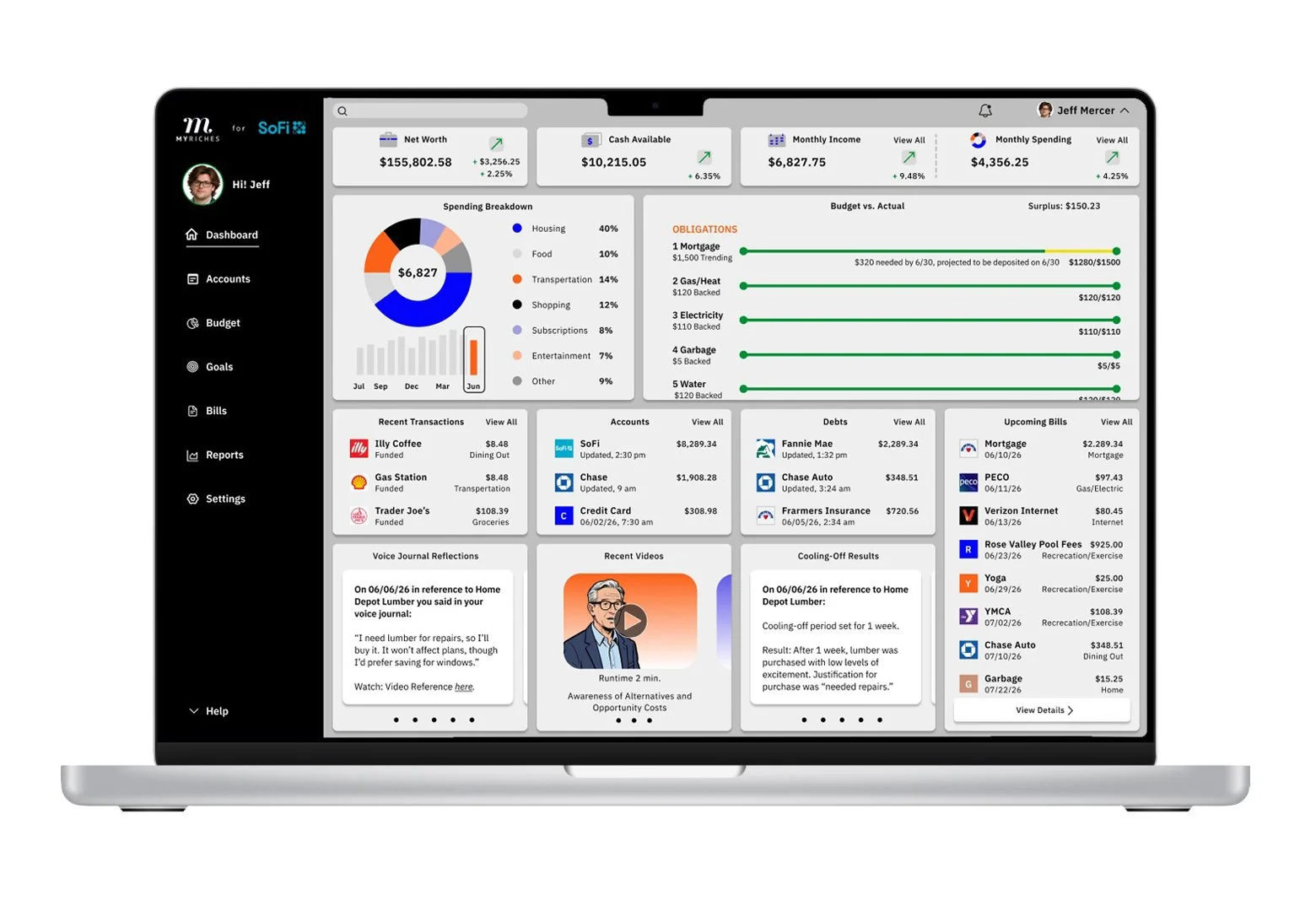
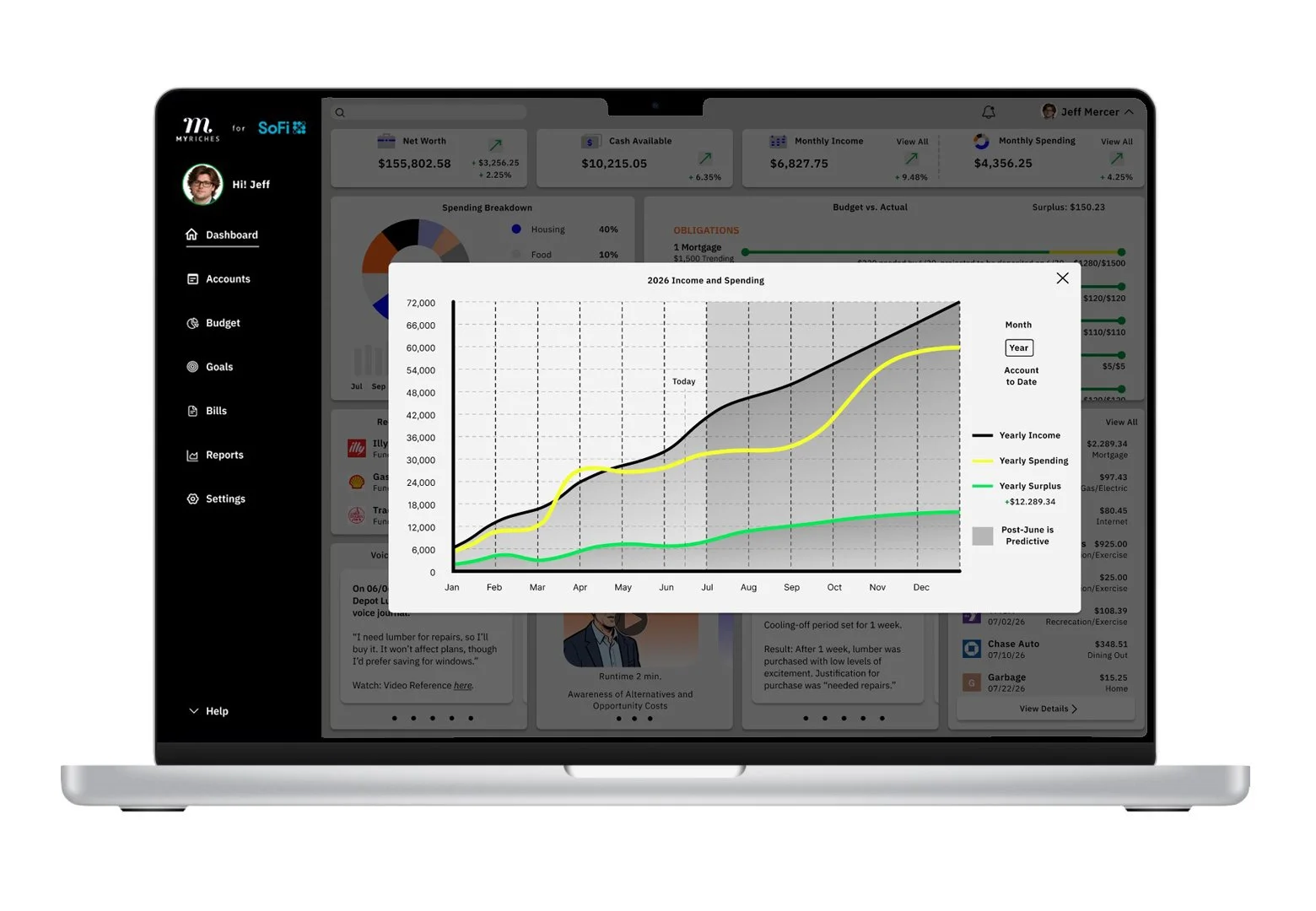
In response to user research, three features were identified for exploration in early digital wireframes: real-time purchase guidance at the moment of decision, simplified financial insights that translate data into clear actions, and reflective dashboard tools that reinforce long-term goals and spending behaviors.
Lo-Fi prototype
Preliminary ideas, simple mockups, early prototypes, foundational concepts, feedback-driven insights, iterative refinement, initial design stages.
View: MyRiches Lo-Fi Prototype
Usability study
Analytical, systematic, user-focused, detailed, empirical, iterative, insightful, comprehensive, diagnostic, interactive, evaluative, effective, informative, user-centric, thorough.
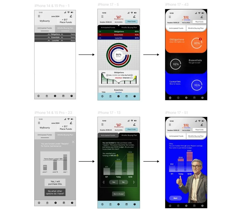
A three-participant usability study of the financial budgeting app revealed key issues, including confusion around budget categories, difficulty interpreting graphs and spending data, a text-heavy interface that hindered comprehension, and unclear guidance during decision-making. Iterative improvements were implemented between low- and high-fidelity prototypes to address these usability challenges and enhance overall clarity, efficiency, and user experience.
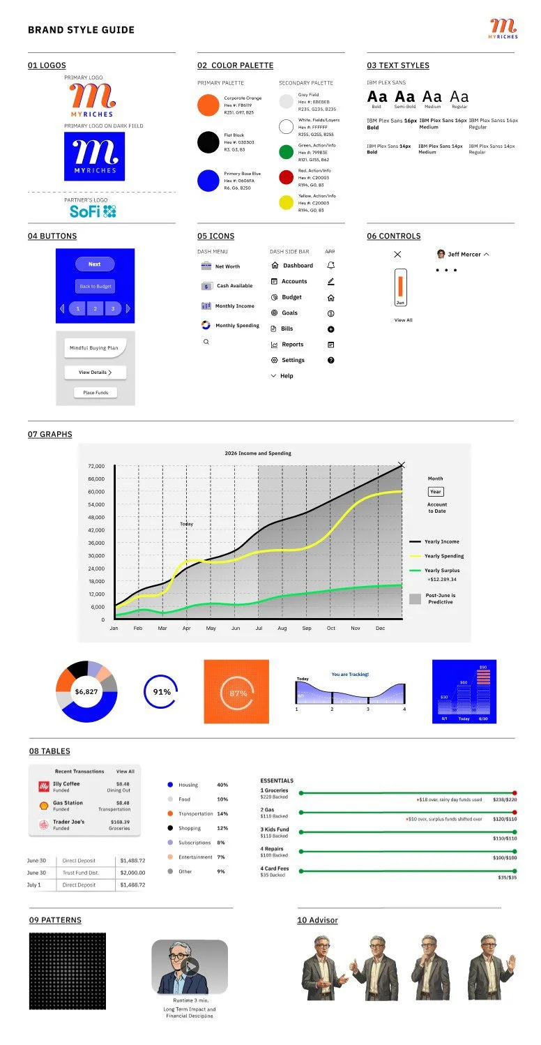
Brand Style Sheet/Guide
This brand style establishes a cohesive visual and verbal identity, ensuring consistency across all touchpoints. It defines typography, color, logo usage, imagery, patterns, tables, and layout, while guiding tone and voice. The system streamlines workflows, supports scalability, and ensures a polished, unified brand presence.
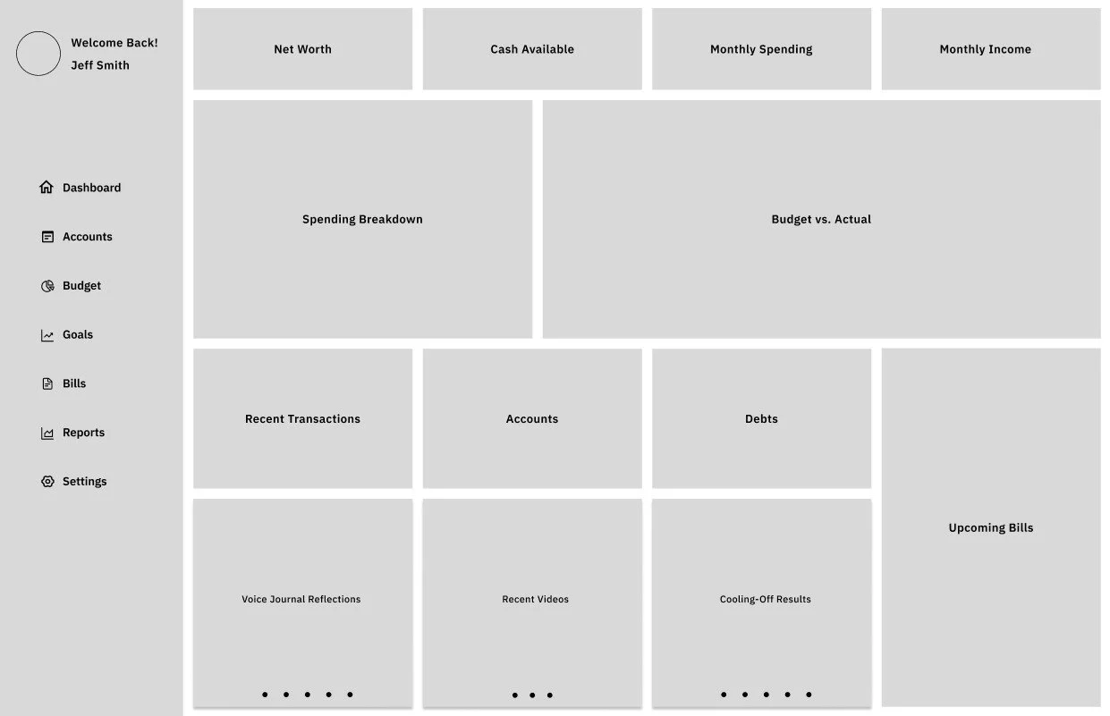
Full-size mock-ups
As the design approached its final form, these visuals helped define and confirm the overall direction. The following pages carry a consistent aesthetic, applying cohesive patterns, typography, color palettes, and layout structures.
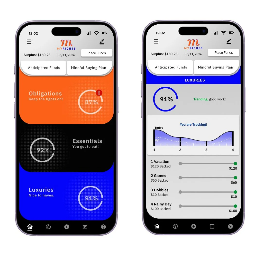
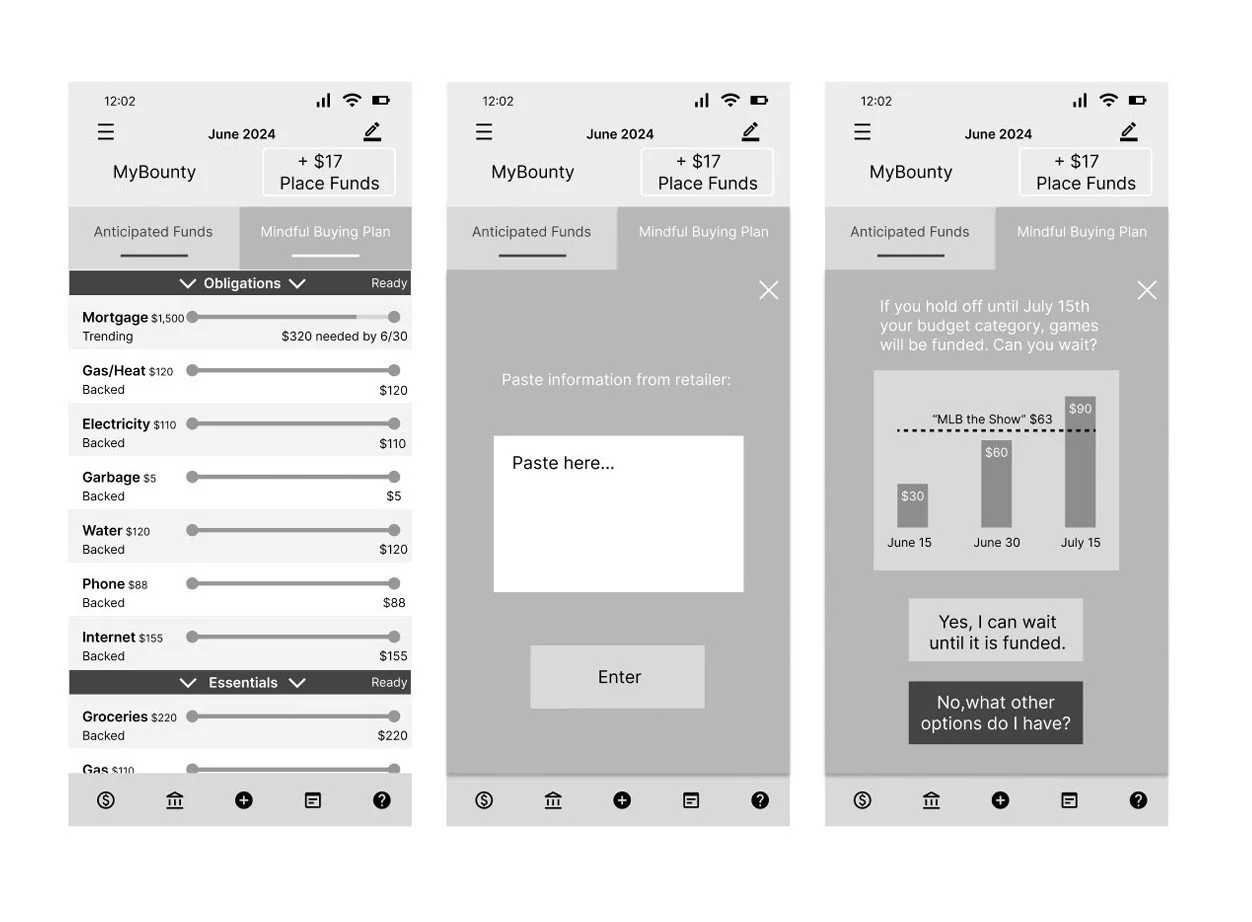
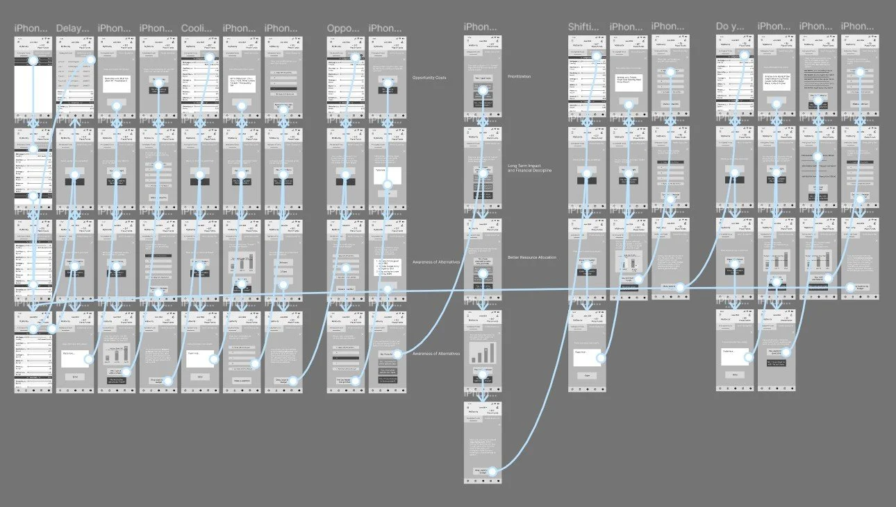
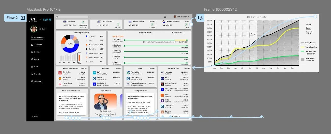
Hi-Fi prototype
Thorough, insightful, cyclical, user-focused, data-driven, assessment-based, analytical, hands-on, structured, precise, evidence-based, problem-identifying, human-centered, comprehensive, streamlined
Takeaways
1. Design for real behavior: People don’t always act rationally with money, features should account for impulses, habits, and biases (like present bias or loss aversion) by making good decisions easier and automatic.
2. Nudge don’t overwhelm: Small, well-timed prompts and clear guidance are more effective than dense data. Framing choices (e.g., showing impact or consequences) helps users make better decisions without feeling judged.
3. Make progress visible and rewarding: Highlight small wins (savings milestones, streaks, goal progress) to reinforce positive behavior and keep users motivated over time.
Accessibility considerations
1. Color contrast & readability: Ensured sufficient contrast for text, charts, and UI elements so users with low vision or color blindness could clearly read balances and data.
2. Clear, simple language: Avoided jargon and explained financial terms in plain language to support users with cognitive disabilities or lower financial literacy.
3. Didn’t rely on color alone: Used labels, patterns, or icons in charts so meaning wasn’t lost for color-blind users.
4. Clear, simple language: Avoided jargon and explained financial terms in plain language to support users with cognitive disabilities or lower financial literacy.
5. Error prevention & recovery: Used clear validation, helpful error messages, and confirmations for critical actions to reduce stress and mistakes.
6. Consistent Navigation: Kept navigation consistent across pages to help users understand and predict where they can find certain elements in the app or on the dashboard.
7. Touch target size & spacing: Ensured buttons and interactive elements were large enough and well-spaced to support users with motor impairments or those using touch devices.
Next steps
1. Validate with usability testing: Test the prototype with users to identify friction, confusion, and decision-making gaps.
2. Incorporate feedback and iterate: Refine flows, UI, and content based on usability findings and stakeholder input.
3. Define interaction and motion specs: Document transitions, micro interactions, and system behaviors for development clarity.
4. Align on content and tone: Finalize microcopy to ensure it feels supportive, clear, and non-judgmental across the experience.
5. Establish a design system: Formalize components, typography, colors, and patterns to ensure consistency and scalability.
6. Collaborate with engineering: Review feasibility, edge cases, and technical constraints to align on implementation.
7. Prepare developer handoff: Provide annotated designs, specs, and assets (e.g., in Figma) for a smooth build process.
8. Conduct accessibility and compliance review: Ensure the product meets accessibility standards and financial regulations (e.g., security, privacy).
9. Launch a pilot or beta test: Release to a limited audience to gather real-world feedback before full rollout.